

Objective / Problem
I initiated the creation of a magazine featuring three previous writings, aiming to present their substance in an appealing way. Selecting a unique name, cover design, and booklet layout posed challenges, along with choosing suitable photographs and typefaces to enhance readability and reflect the publication's aesthetic. I focused on creating a cohesive and orderly layout to guide readers through the contents. The ultimate goal was to build a magazine that effectively conveys the ideas of the papers and engages readers.
Concept / Solution
I devised a concept for the magazine using custom publishing to enhance its appearance and feel. Utilizing a combination of newspaper, Manila paper, and inkjet printing, I aimed to create a raw and genuine aesthetic. Perfect binding ensured durability and professionalism, while attention to detail showcased craftsmanship. This concept combines traditional and modern printing methods to create an immersive reading experience that engages the senses and leaves a lasting impression.
Process /
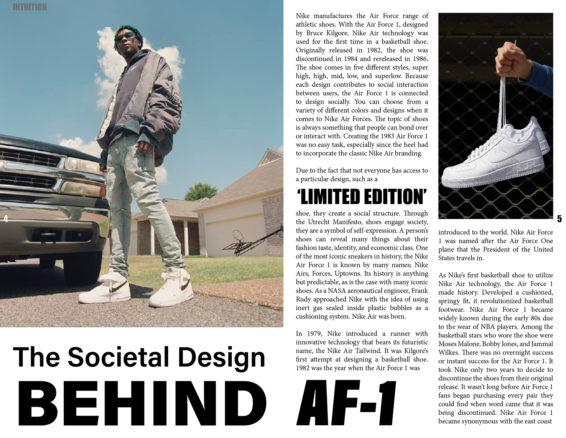
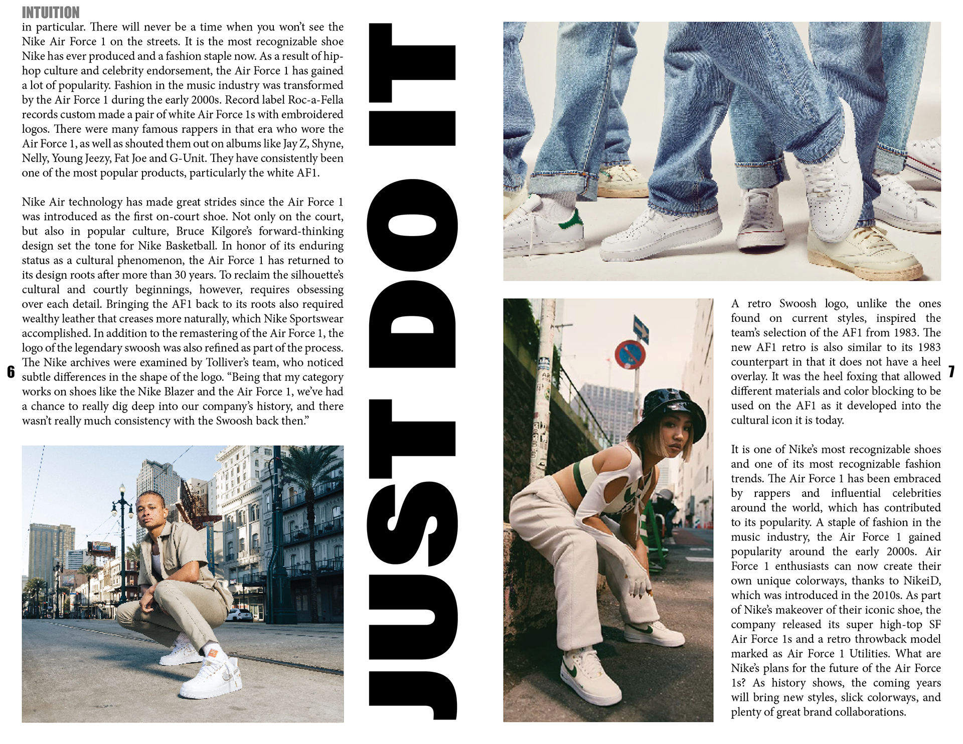
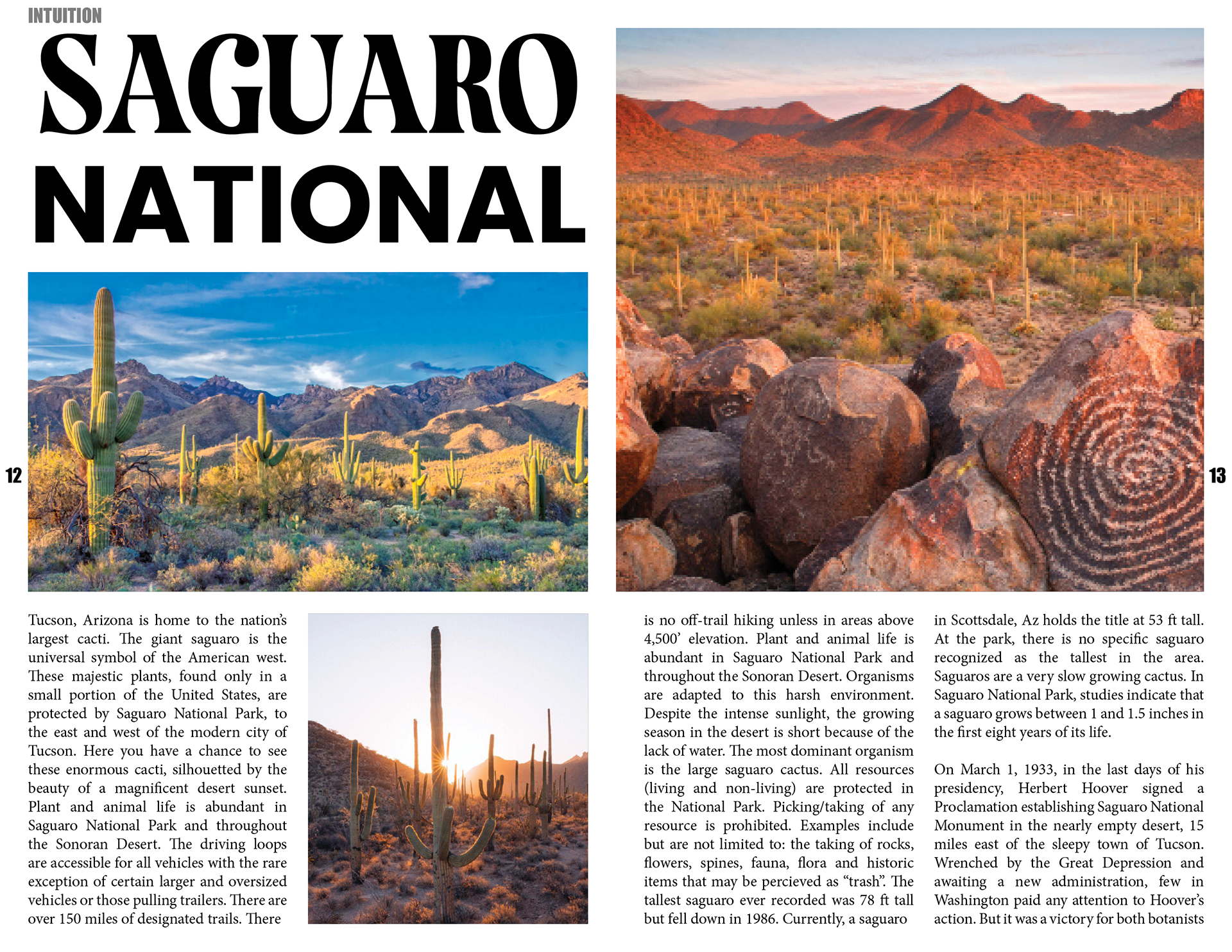
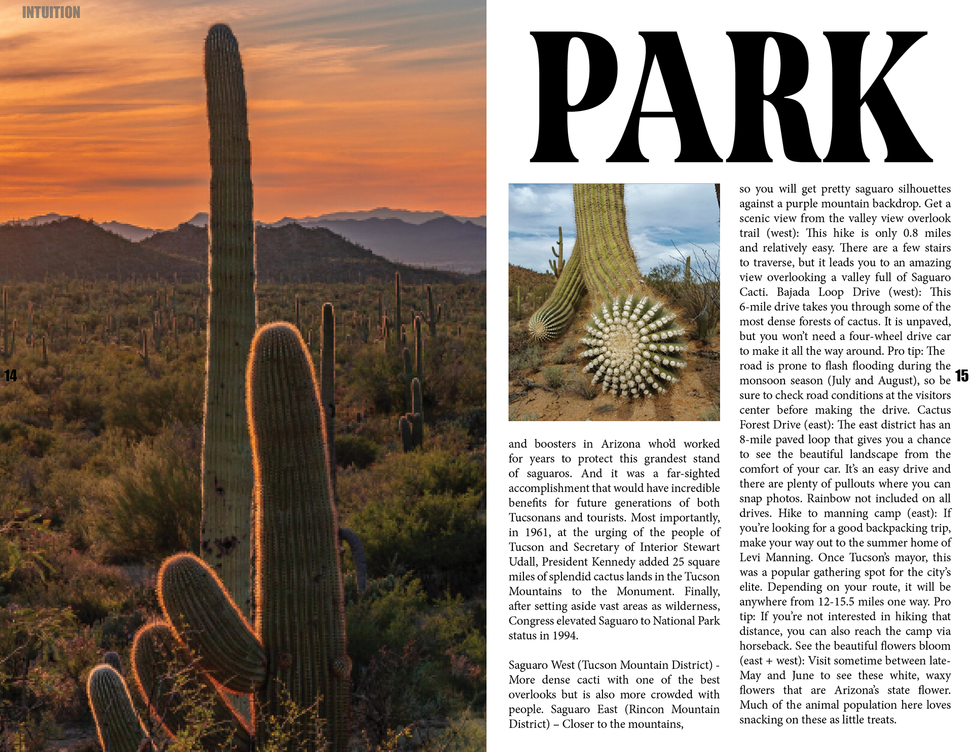
I managed the unique publishing process, ensuring quality and coherence throughout. Articles were edited for clarity and conciseness, followed by the selection of images that matched the subject. Using Adobe InDesign, layouts were created, with careful attention to text and graphics placement. The magazine was printed either professionally or in-house, considering factors like texture and image quality. Perfect binding was meticulously examined, with final quality assurance tests confirming the publication met standards. This process resulted in a tailored publication that effectively promoted articles, engaged readers, and showcased expertise.
Value-significance /
I utilized InDesign to meticulously craft the layout and placement of elements within the custom publication, enhancing readability and engagement. By leveraging InDesign's features, I created a visually captivating and well-organized design that communicated the content effectively and reinforced the publication's branding. Thoughtful placement of images, text, and graphical elements ensured a cohesive and harmonious layout, contributing to a seamless reading experience and elevating the perceived quality and professionalism of the magazine.
